#3560 closed defect (fixed)
Revisit layout of tabs
| Reported by: | erikos | Owned by: | humitos |
|---|---|---|---|
| Priority: | Low | Milestone: | |
| Component: | Browse | Version: | Git as of bugdate |
| Severity: | Unspecified | Keywords: | 13.1.0, design, r+, olpc-test-passed |
| Cc: | humitos, erikos, danielfrancis | Distribution/OS: | OLPC |
| Bug Status: | Unconfirmed |
Description
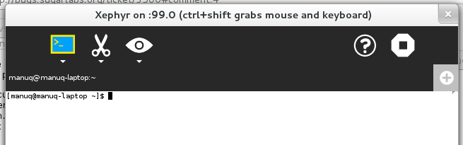
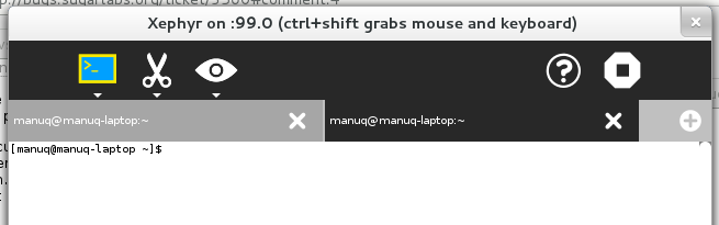
We should see if the tabs layout in Browse (probably as well Terminal) is the best we can do. In mobile Safari, a tab takes up all the space if possible, for more than one tab the space is deviced by the number of tabs. The tab close icon has to be on the left then to not get in the way
with the 'add-tab' icon, though.
This layout has the advantage that the switching between tabs has always the maximum 'hit' area. As well the title displayed on the tab has more space and elipsizing does not happen as early.
Maybe something we can revisit in this cycle.
Attachments (5)
Change History (20)
comment:1 Changed 12 years ago by humitos
- Cc humitos manuq added
- Keywords design added
- Priority changed from Unspecified by Maintainer to Low
comment:2 Changed 12 years ago by manuq
Terminal gtk3 branch added the proposed tab layout to experiment.
comment:3 Changed 12 years ago by manuq
- Cc erikos added; manuq removed
- Keywords 13.1.0 added; 12.2.0 removed
- Owner changed from erikos to manuq
- Status changed from new to assigned
comment:4 Changed 12 years ago by manuq
I think I have used for enough time both options to make an opinion. The current one with Browse and the one proposed here with Terminal, the two activities I use the most.
I prefer the current fixed sized tabs, like in Browse. I specially dislike the looking for only one tab opened in Terminal (gtk3 branch). Looks like another toolbar, and this is the default when you start from scratch. Tapping the current tabs in a touchable device is confortable and I don't miss the maximun hit area from Terminal.
comment:5 follow-up: ↓ 6 Changed 12 years ago by garycmartin
I do like tabs that expand to take up all available space maximising hit targets, providing maximum space for the tab titles, and no magic numbers for width. However with our flat dark grey toolbar and tab backgrounds (no shading, no edges) the default start case with just one full width tab doesn't look very distinctive as a tab, but more a fat toolbar with an unusual light grey square icon with a (+) inside on the right. Perhaps a compromise could be start with a tab size that leaves enough room for another of equal width, e.g. start at 50% width tab, 50% width empty light grey fill with the (+) icon at right.
comment:6 in reply to: ↑ 5 Changed 12 years ago by manuq
Replying to garycmartin:
I do like tabs that expand to take up all available space maximising hit targets, providing maximum space for the tab titles, and no magic numbers for width. However with our flat dark grey toolbar and tab backgrounds (no shading, no edges) the default start case with just one full width tab doesn't look very distinctive as a tab, but more a fat toolbar with an unusual light grey square icon with a (+) inside on the right. Perhaps a compromise could be start with a tab size that leaves enough room for another of equal width, e.g. start at 50% width tab, 50% width empty light grey fill with the (+) icon at right.
+1, let's try it in Terminal. I asked Daniel Francis if he can make the change.
comment:7 Changed 12 years ago by danielfrancis
- Cc danielfrancis added
comment:8 Changed 12 years ago by danielfrancis
I made the change, it's now commited on the git repository.
comment:9 Changed 12 years ago by manuq
- Owner changed from manuq to humitos
Thanks Daniel, humitos can do the port back to Browse of your code, and maybe set a maximun number of tabs per screen.
Changed 12 years ago by humitos
comment:10 Changed 12 years ago by humitos
- Keywords r? added
comment:11 Changed 12 years ago by manuq
Pushed humitos change for Browse as f96776a4 with the same behaviour as Terminal.
comment:12 Changed 12 years ago by humitos
- Keywords r+ olpc-test-pending added; r? removed
comment:13 Changed 11 years ago by manuq
- Resolution set to fixed
- Status changed from assigned to closed
comment:14 Changed 11 years ago by greenfeld
- Keywords olpc-test-passed added; olpc-test-pending removed
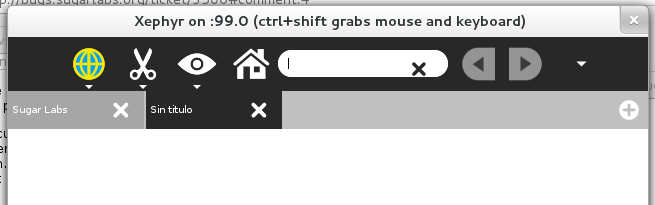
Tabs in Browse and Terminal start out taking 50% of the available horizontal width (with a + button at the end) and adjust in size appropriately when more items are added. Eventually scrollbars are added to avoid adding too many tabs (although Terminal allows several more tabs before this happens than Browse).
Checked in 13.1.0 os27.
Google Chrome, for example, works in the same way as Browse now. The initial tab-width is fixed when it is opened and then if there are many tabs it's reduced.