Opened 14 years ago
Last modified 10 years ago
#2282 closed enhancement
Don't require the user to experiment to find out what the color-selector icons are for — at Initial Version
| Reported by: | mikus | Owned by: | |
|---|---|---|---|
| Priority: | Unspecified by Maintainer | Milestone: | Unspecified |
| Component: | design | Version: | 0.90.x |
| Severity: | Unspecified | Keywords: | |
| Cc: | Distribution/OS: | OLPC | |
| Bug Status: | Unconfirmed |
Description
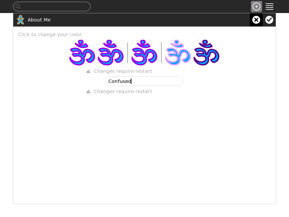
XO-1 os1 (F14) sugar-0.89.7
For someone who has not previously used the color-selector (in 'My Settings' -> 'About Me'), currently there is NO guidance provided.
There appears to be enough vertical space to be able to move the "name" entry field down a bit. Then a small image (outline gray, center black) could be placed centered under the two lefttmost colored icons, and a small image (outline black, center gray) could be placed centered under the two rightmost colored icons. This would give the user a clue as to WHAT would be affected by clicking on those non-central icons.
Also, I personally would prefer to have a larger visual gap (spacing) to separate the central colored icon from the others.
Color selector - how to change the "fill" is not obvious