Opened 14 years ago
Last modified 9 years ago
#2282 closed enhancement
Don't require the user to experiment to find out what the color-selector icons are for — at Version 2
| Reported by: | mikus | Owned by: | |
|---|---|---|---|
| Priority: | Unspecified by Maintainer | Milestone: | Unspecified |
| Component: | design | Version: | 0.90.x |
| Severity: | Unspecified | Keywords: | |
| Cc: | Distribution/OS: | OLPC | |
| Bug Status: | Unconfirmed |
Description (last modified by mikus)
Change History (4)
Changed 14 years ago by mikus
comment:1 follow-up: ↓ 2 Changed 14 years ago by walter
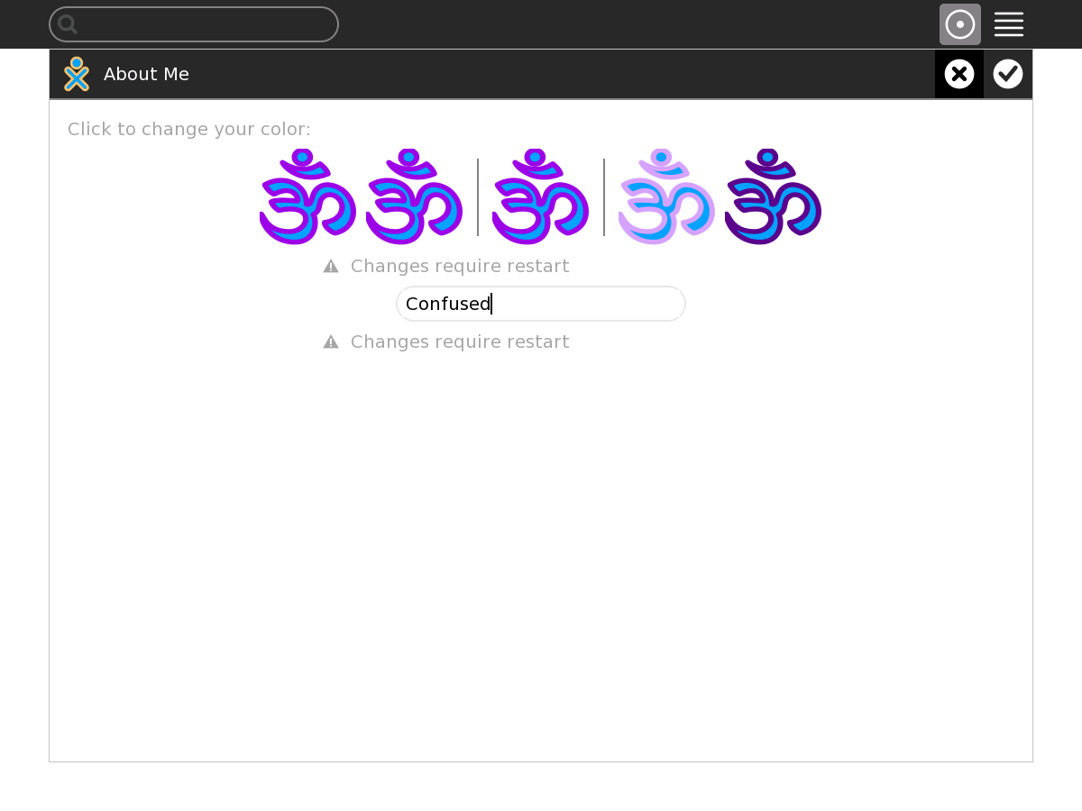
I am confused about what I am seeing in your attached PNG file. I notice that you made your own icon. Perhaps you could attach that icon to the ticket, as I think it may be the source of the problem/confusion.
comment:2 in reply to: ↑ 1 Changed 14 years ago by mikus
- Description modified (diff)
Replying to walter:
I notice that you made your own icon. Perhaps you could attach that icon to the ticket, as I think it may be the source of the problem/confusion.
I believe you are missing the reason why I wrote #2282. For me, the SHAPE of the icons is a "strawman" -- right now the user is presented with five icons, without a CLUE (especially if not connected to the wiki on the internet) as to how he is supposed to work with those icons. I am suggesting that some graphical 'guides' be added to this particular screen, to introduce the user to a quicker understanding of the the function of those five icons.
Per your request, I am attaching the icon I use. I have been using that same icon for over two years, and it has never given me any trouble. [I did not make that icon myself - I got it from one of the commercial "parts suppliers" for the OLPC.]
Color selector - how to change the "fill" is not obvious