#1084 closed enhancement (fixed)
Usability enhancements for Turtle Art
| Reported by: | Jose Icaza | Owned by: | walter |
|---|---|---|---|
| Priority: | Unspecified by Maintainer | Milestone: | Unspecified |
| Component: | Sugar on a Stick (SoaS) | Version: | 0.84.x |
| Severity: | Minor | Keywords: | usability, turtle art |
| Cc: | Distribution/OS: | Unspecified | |
| Bug Status: | New |
Description
TurtleArt - some usability issues. TurtleArt version: the one in Strawberry as of July 20 2009. [question: how do I know what version of an activity I am using?]
*Turtle tab*
Usability 1:
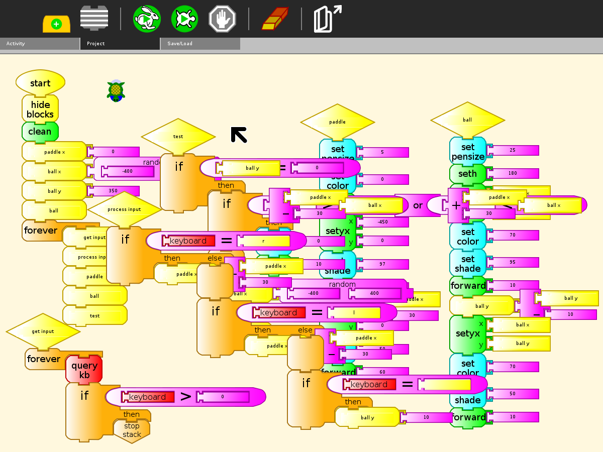
Mystery block: There is a block with a blank square inside it. One has to pull it out to discover that it is a "get something from journal" block.
Suggestion: I think the block should have a journal icon inside it. An example of ussage (say, to display an image as turtle terrain) would be nice in the Examples folder
*Keyboard tab*
usability 2:
Mystery block: The "special block" with the 8-pointed wheel in it does nothing until an actual new block coded in python is loaded in. While this is a nifty feature, it makes the U.I. confusing.
Suggestion: that block and the other 4 below it should not appear until an actual new block is loaded in.
Usability 3
Expectation: The keyboard variable gets a character value and that value can be printed, tested and so on
Reality: When "show keyboard" or "print keyboard" is executed, one gets the ASCII value of the character. This is confusing. Related: (defect...) Testing against the value of keyboard variable as shown in http://wiki.sugarlabs.org/images/d/dd/WeGotGame2.png does not work. I have to test it against the ASCII value.
*Flow tab*
Usability 4
The block with a lock in it looks very different when pulled out. And it is not clear what the lock icon is for?? I think it is unnecessary to put that lock icon there. The image of the block when pulled out is explicit enough.
*My blocks tab*
Great to be able to have any number of subroutines =)
Usability 5: For clarity, the blocks with a blank text field inside should be aligned with their equivalents above.
For instance, the "any action" block should be in the same column as the Action 1 and Action 2 blocks and have the same shape. In this way it would be graphically obvious: "this is the same as the above except it can be named"
Usability 6
We have a "stop stack" block; but the stacks of blocks are called by default action 1, action 2... shouldn't they be called Stack 1, Stack 2? or else the other "Stop action"?
--jose I.
Change History (5)
comment:1 Changed 15 years ago by walter
- Severity changed from Unspecified to Minor
- Status changed from new to accepted
comment:2 Changed 15 years ago by walter
comment:3 Changed 15 years ago by Jose Icaza
great! that was quick =)
On your comments:
- I think I will change the graphic from the gear (view source) to the pippy icon.
Yes, that'll make more clear the intention of that block. The pippy icon would identify that block with the "load my block" icon
- Not sure I follow you. Isn't the shape already the same? Just the size is different. (Could you attach some sketches?)
I was thinking on a shape for the block like the one above left of the lock block, but with a longer middle section. But then it wouldn't fit in. So I think it's ok as it is if you decided to leave it.
comment:4 Changed 15 years ago by walter
- Resolution set to fixed
- Status changed from accepted to closed
I think I caught all of these in v58.
comment:5 Changed 14 years ago by sascha_silbe
- Component changed from Turtleart to SoaS
- Distribution/OS changed from SoaS to Unspecified
Bulk change distribution=SoaS -> component=SoaS
Thanks Jose. This is great feedback.
Comments:
If you use the List View on the Home Page, you can see the version number listed.